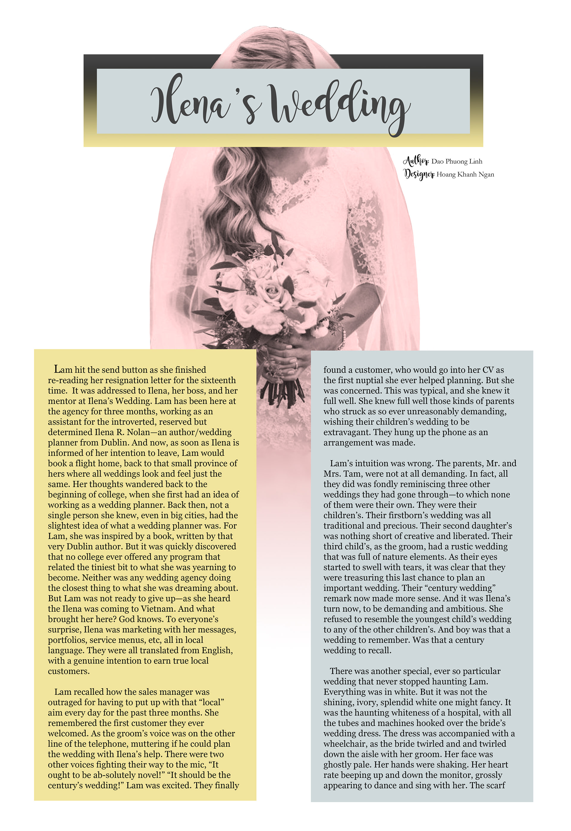
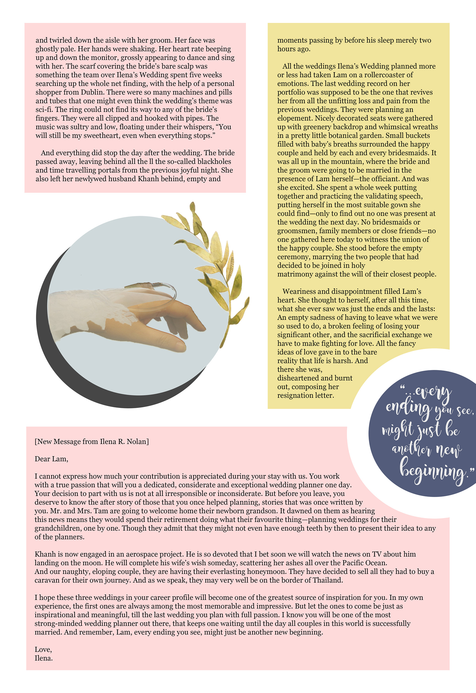
My first magazine spread that i design for a monthly paper for rmit vietnam's student association. the theme was wedding and illness, so i want to create a piece with minimalist style and bitter sweet tone with cold pastel colors.
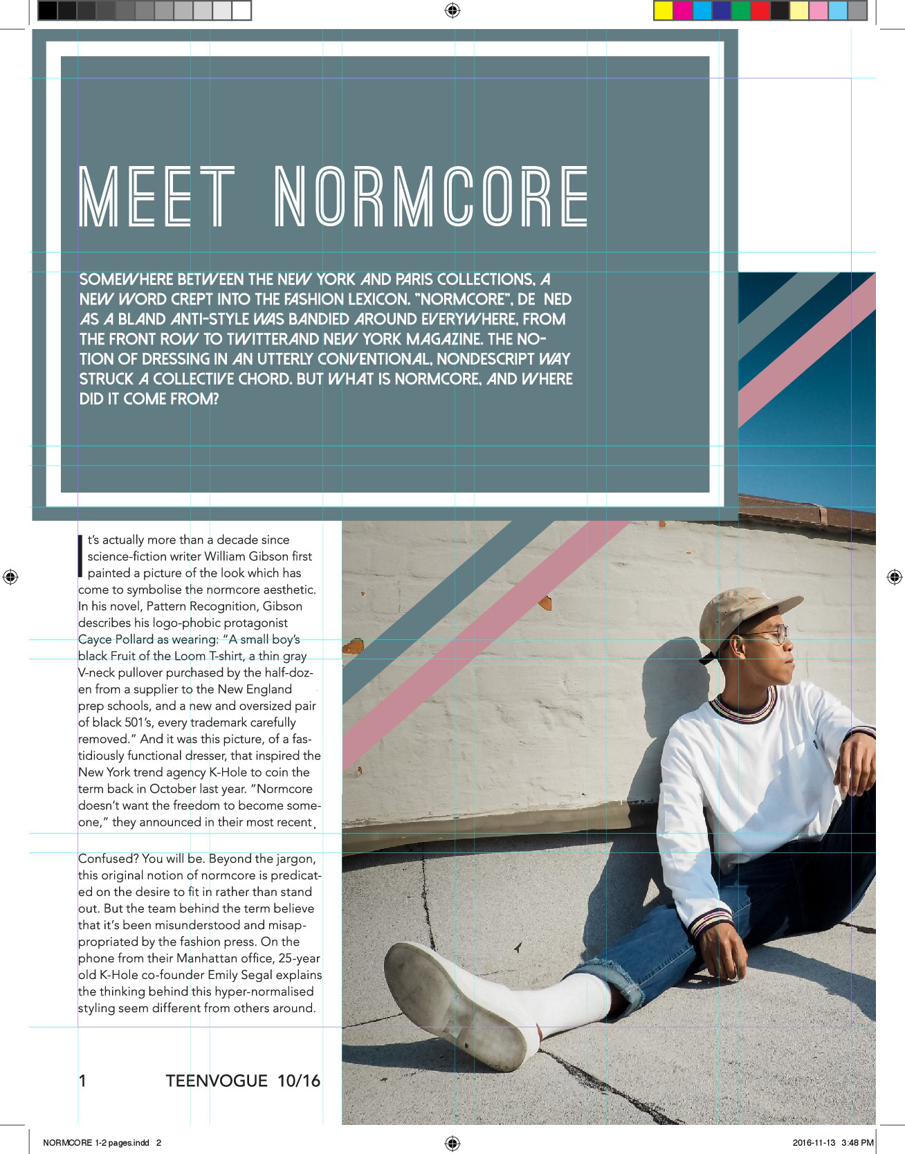
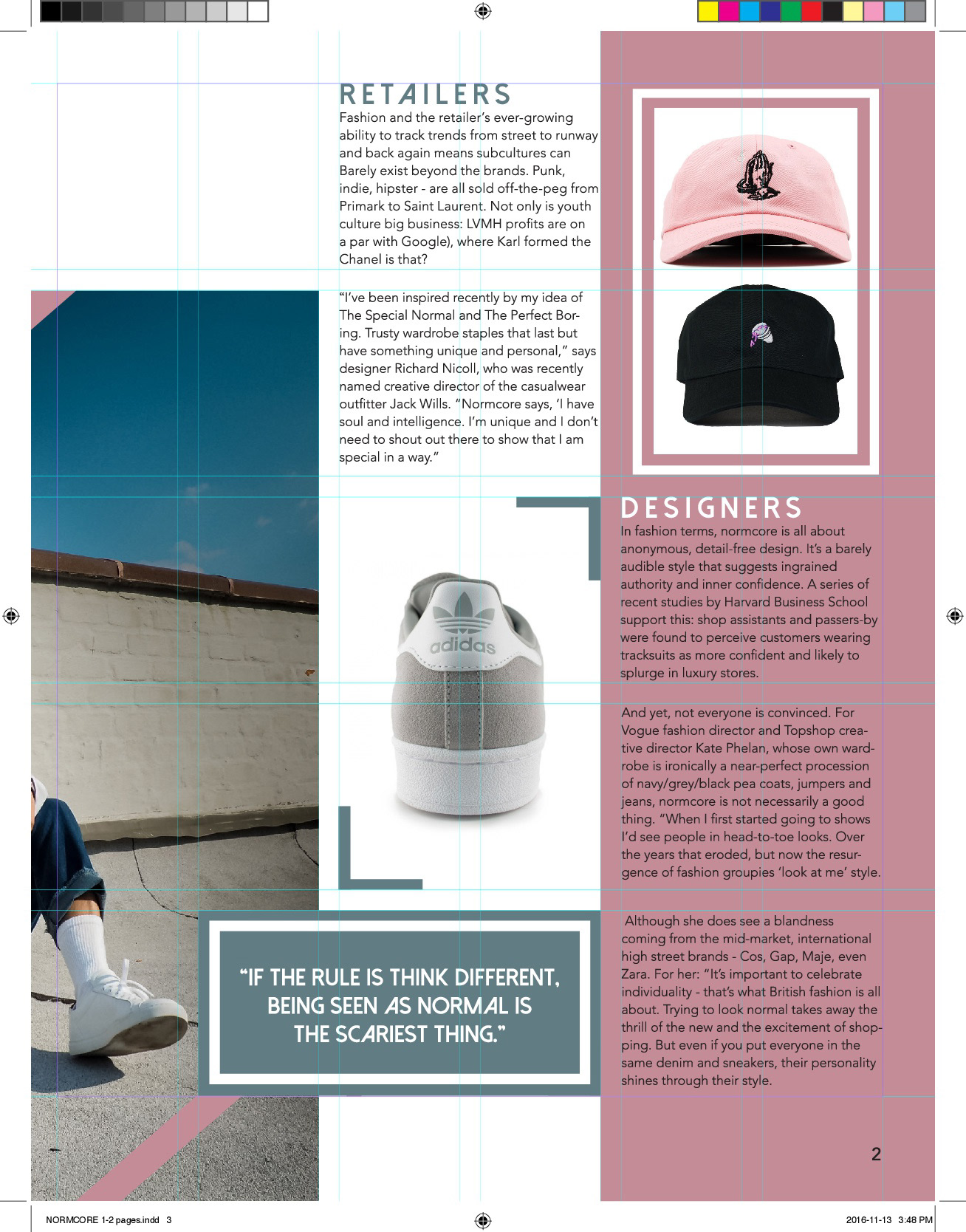

These coupe of pages are the resulted of collaborate with my classmates in my graphic design course. We tried to make it more restricted to the grids and guidelines and the theme more commercial.
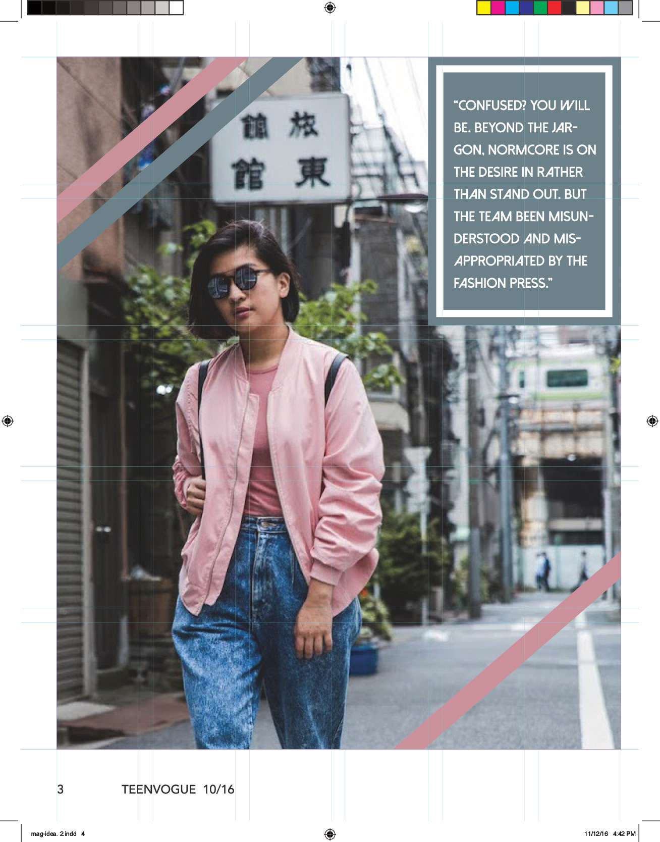
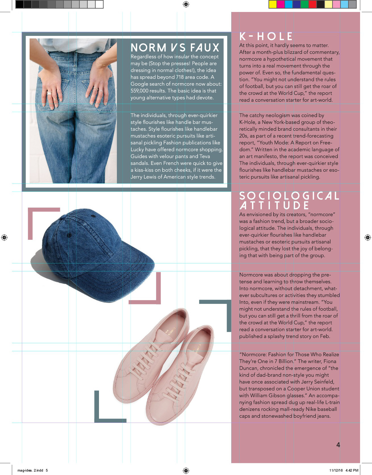
For our fashion magazine pages, we used two main colors: pink and turquoise, and limited our items in those color only. we chose san serif font to makes the spread seems modern and youthful, on brand with our subject.
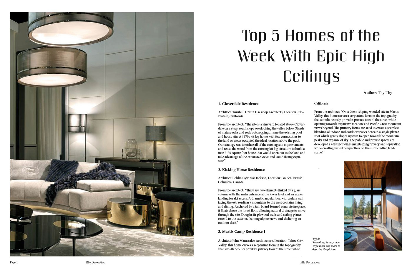
whether our my furniture magazine pages, we picked gray/pearl tone for palette and chose serif font to make the pages look classy and traditional.